Do QR codes have to be black and white?
No. Do qr codes have to be black and white? They do not, but your color choices can make scanning fail. The key requirement is strong contrast between the dark modules and the background, while keeping the finder patterns and quiet zone clean and untouched.
- Use a darker foreground on a lighter background whenever possible.
- Keep the quiet zone clear on all sides.
- Test on real phones, in real lighting, and on the real printed material.
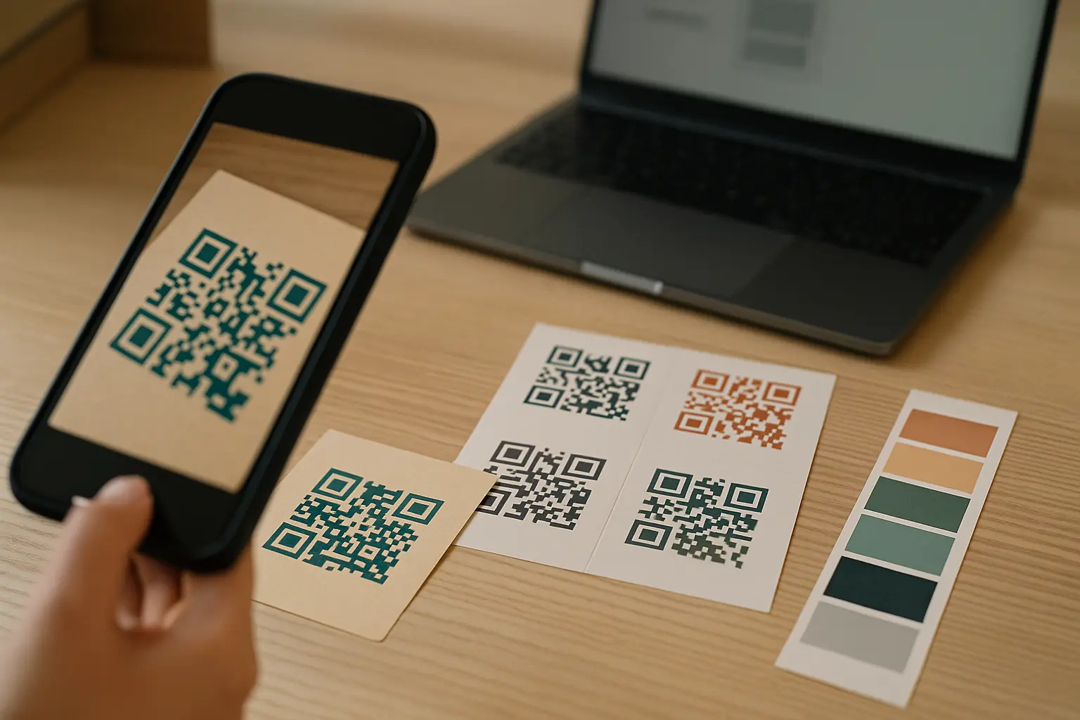
QR codes don’t have to be black and white, but they do need strong contrast and scanner-friendly design. This guide shows which color choices work, which fail, and how to test before you print. You will also get a lightweight standards grounding and a practical checklist to reduce surprises.
TLDR: QR codes can be colored if the foreground is clearly darker than the background and the quiet zone stays clean. Check contrast before publishing, then test across devices and lighting, and always proof on the final print finish.
Direct answer: black-and-white is common, not required
Black-on-white is the default because it is the easiest way to create a clear light-dark boundary for cameras to detect. If you are asking do qr codes have to be black and white, the practical answer is no, but black-on-white is the most reliable starting point.
You will also see the question phrased as do qr codes need black on white. They do not, yet dark-on-light is the safest pattern because many scanning flows are tuned for it, and because print and lighting issues tend to reduce contrast rather than increase it.
Color is useful when you want a custom QR code that fits packaging, posters, or campaign design systems. The tradeoff is that customization adds more ways to fail, including:
- Foreground and background that are too similar in brightness.
- Artistic effects that soften module edges.
- Busy backgrounds that crowd the quiet zone.
- Print finishes that add glare.
A simple decision framework helps keep design choices testable: Pick a foreground/background pair, verify contrast, then test on-device and in print conditions.
Why QR scanners care about contrast (not “pretty colors”)
A scanner does not “understand” color the way people do. It looks for a pattern of light and dark areas and tries to decode it. That is why can a qr code be any color is only true in a limited sense. It can be many colors, as long as the camera sees a strong difference in brightness, also called reflectance, between the code and its background.
QR codes are made of modules arranged in a grid. The scanner relies on fixed structural features, including:
- Finder patterns (the large corner squares) to locate and orient the code.
- Alignment patterns (smaller target-like marks) to correct distortion, especially in larger symbols.
- The quiet zone (the clear margin) to separate the symbol from surrounding graphics.
Those structures are defined by the governing specification, ISO/IEC 18004:2024. The standard also defines sizes across QR Code versions (Version 1 to Version 40), ranging from Version 1 (21×21 modules) to Version 40 (177×177 modules). Bigger versions can carry more data, but they also make print quality, blur, and contrast even more noticeable.
A quick history note: QR codes were invented in 1994 by Masahiro Hara of Denso Wave. From the start, fast detection depended on clear, machine-readable contrast.
Is there an official standard that governs QR code colors? ISO/IEC 18004:2024 governs QR code structure and decoding, not a fixed “allowed colors” list, so color choices are effectively governed by whether scanners can detect the required light-dark patterns.
In practice, dark foreground on a light background means the modules read as “dark” across the entire symbol, including the finder and alignment patterns.
Contrast guidelines and how to check them
Designing for contrast means planning for real cameras and real lighting, not just how the code looks on a bright monitor. This is where qr code contrast ratio for reliable scanning becomes a useful concept: it is a way to estimate how separated the foreground and background will appear.
This varies by tool. Some contrast checkers and QR design research cite 4.5:1 as a minimum recommendation and 7:1 or higher as a strong target, but you still need to validate with your devices, lighting, and print finish.
Use one repeatable pre-publish check:
- Pick your foreground (module) color and background color, and avoid “almost the same” brightness.
- Check the pair in a contrast checker using the foreground as the darker color and the background as the lighter color.
- Export the QR code in a format that keeps edges sharp, then place it on the real background it will sit on.
- Test-scan on more than one phone camera and more than one scanning app, then test again in dimmer light and at slight angles.
- If it will be printed, scan a printed proof on the actual material and finish.
Lighting and camera quality matter because auto-exposure, glare, noise in low light, and focus blur can effectively lower contrast. This varies by device and scanning app.
Do all smartphones scan QR codes with non-standard colors equally well? No, results vary by phone camera, OS camera app, and the scanning app’s image processing, so a colored design that works on one device can fail on another, especially in low light or with glare.
Best color combinations (and combinations to avoid)
If you are choosing from brand colors, focus first on brightness separation, then on hue. The goal is simple: prefer dark modules on a light background, with crisp, undistorted edges.
This section maps to best qr code color combinations for printing. For print, “dark” needs to stay dark after ink hits paper, and “light” needs to stay light under the lighting where people will scan.
Common risky pairs are those with low brightness separation or similar hues. Examples often flagged in design guidance include light yellow on white and red on orange, because the camera may not see a strong boundary.
Are there specific color combinations that always fail? No combination fails 100% of the time in every setting, but low-contrast pairs and similar-brightness pairs are consistently risky, and they often fail faster under glare, dim light, or lower-quality printing.
Safe vs risky color pairings (rule-of-thumb)
| Foreground (modules) | Background | Risk level | Notes |
|---|---|---|---|
| Black | White | Low | Most tolerant of lighting and print variation. |
| Very dark blue | White | Low | Usually reads as “dark” to the camera. |
| Dark green | Pale gray | Medium | Can work, but verify contrast and print proof. |
| Dark red | Orange | High | Similar brightness can blur module edges. |
| Light yellow | White | High | Often too little separation for cameras. |
| Medium gray | Light gray | High | Looks subtle to people and to scanners. |
Takeaway: Treat “dark-on-light” as the default, and treat “close shades” as a warning sign even if they look fine on screen.
Visual: Side-by-side mockups (conceptual)
| Mockup | What you changed | Typical outcome |
|---|---|---|
| Dark-on-light | Dark modules on a light background | Most reliable. |
| Low-contrast | Modules and background are close in brightness | Frequent scan failures. |
| Inverted | Light modules on a dark background | Higher failure risk unless tested widely. |
Example scenario: brand color QR on packaging
Hypothetical example: A package uses a deep brand purple and an off-white background. Use the deep purple for the modules, keep the background off-white, and keep the quiet zone off-white too. Then verify contrast, print a proof on the actual packaging material, and test-scan under store-like lighting.
Inverted QR codes (light-on-dark): when they fail
An inverted QR code flips the usual pattern: light modules on a dark background. This is where inverted qr code light on dark issues show up most often.
Why inversion is riskier:
- Many scanning flows effectively assume dark modules against a lighter field.
- Dark backgrounds are more likely to introduce glare hotspots, noise in low light, or crushed shadows.
- If the “light” modules are not truly light in the camera image, the code can lose its grid definition.
If you must invert, treat it as a special case that requires extra testing across devices and apps. Keep the light modules very bright, keep the background very dark, and avoid placing the inverted code on textured or reflective dark materials.
Safer alternatives usually keep the code itself dark-on-light, while using design elements around it for branding. Another option is to place the QR code in a light “badge” area, preserving a light background and a clean quiet zone.
Gradients and multi-color designs without breaking scans
Gradients can look good, but they also create local areas where contrast drops. That is why qr code gradient colors scanning reliability depends less on the style and more on whether every part of the symbol keeps enough separation.
Constraints that tend to be safer:
- Keep gradients subtle and avoid creating light regions that match the background.
- Keep the darkest portion covering most of the code, including around finder patterns.
- Keep module edges sharp. Avoid blur, glow, or texture that rounds corners.
Some design guidance recommends limiting gradients to two colors so you can control the darkest and lightest ends more predictably. Even then, a gradient that passes on screen may fail after printing, especially if the lighter end shifts lighter on paper.
If you want a multi-color look, a safer approach is to keep modules a single dark color and use color in the surrounding design, while preserving the quiet zone.
Quiet zone and layout rules you can’t ignore
The quiet zone is the clear margin around the QR code. It is not decoration. It is part of what helps scanners separate the symbol from the background and quickly locate finder patterns.
This section maps to qr code quiet zone size requirement. A common minimum guidance is a quiet zone of at least 4× the module width on all sides. In other words, if one module is one “unit,” you want at least four empty module-units of clear space around the code.
Common layout mistakes:
- Letting background patterns, text, or borders touch the code edge.
- Putting the QR code on a photo or gradient background without a solid, clean buffer.
- Cropping too close when exporting or placing the artwork.
Visual: Annotated QR code structure (conceptual)
Quiet zone (clear margin) all around
┌─────────────────────────────────────┐
│   ███       (Finder)        ███     │
│   █ █  Modules (data grid)  █ █     │
│   ███                        ███     │
│                                     │
│              ○ (Alignment)          │
│                                     │
│   ███                         ███    │
│   █ █        (Finder)         █ █    │
│   ███                         ███    │
└─────────────────────────────────────┘
Takeaway: Treat the quiet zone like “no-fly space.” If anything intrudes, scanners can mis-detect the boundary and fail before decoding even starts.
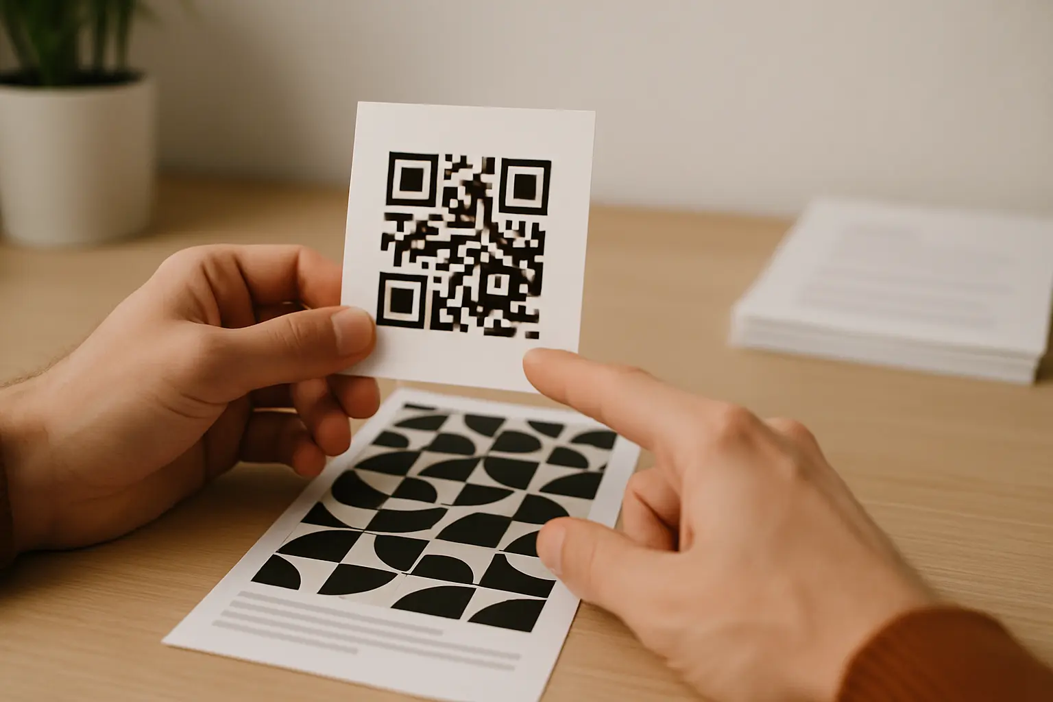
Logos, design overlays, and error correction tradeoffs
Logos and overlays are common in custom QR code designs, but they can block modules that carry data or, worse, interfere with the structural patterns. This is where qr code logo placement with error correction matters.
QR codes use Reed-Solomon error correction, and you can choose among error correction levels (L, M, Q, H). Higher levels can help the code survive some obscured or damaged modules, which is why designers often pair logos with higher error correction. The tradeoff is that higher error correction reduces available data capacity, which can push you into a higher QR Code version (more modules) and make printing and scanning less forgiving.
Placement rules that reduce risk:
- Never cover the finder patterns.
- Be cautious near alignment patterns, especially on larger versions.
- Keep the logo modest in size and centered, and test with the final artwork.
Can logos or images be placed in colored QR codes without breaking functionality? Yes, sometimes, but only if the overlay does not block critical patterns and the remaining modules still decode with the chosen error correction level, so it needs testing on multiple devices and in print.
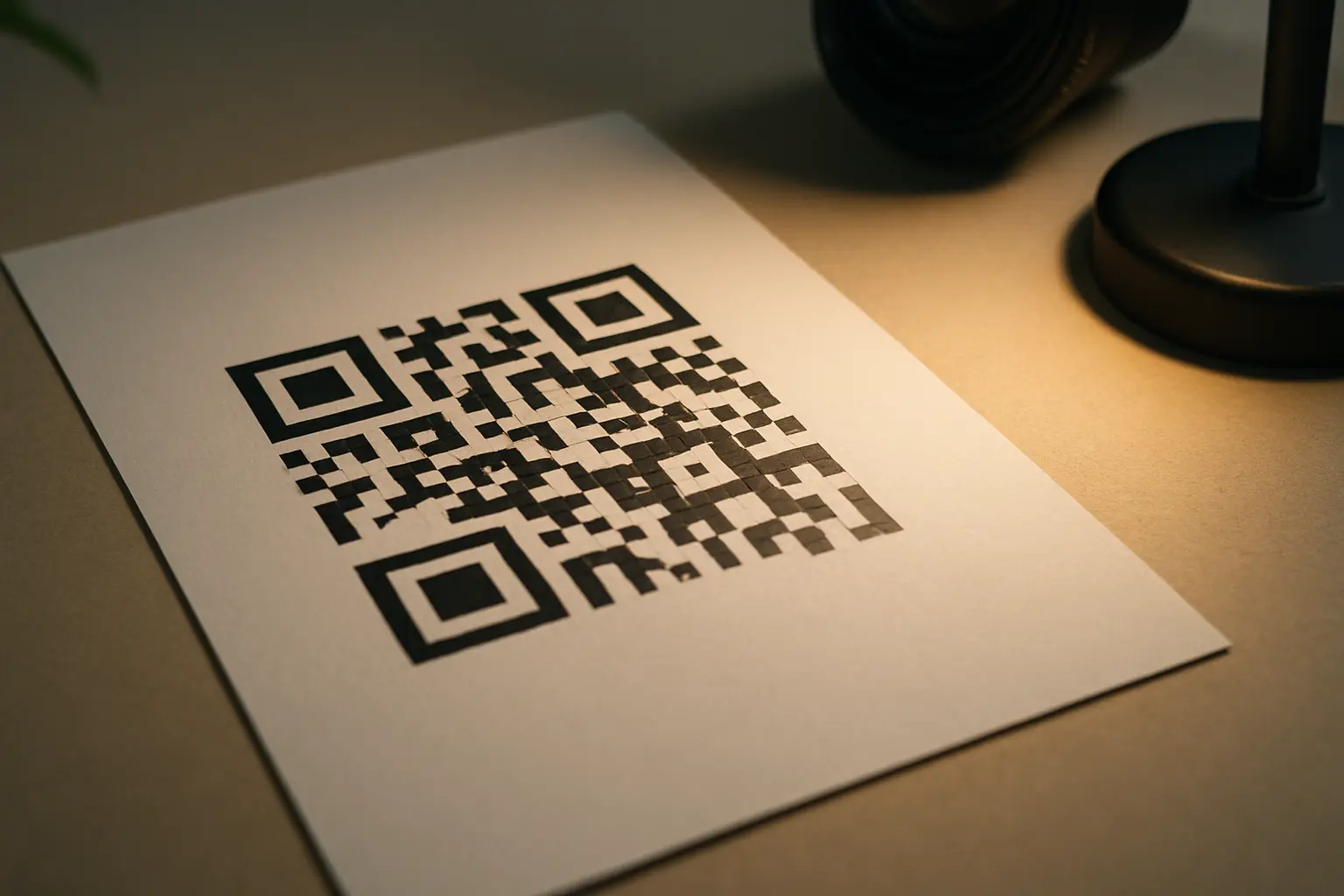
Print and material pitfalls (where good designs still fail)
A design that scans perfectly on a screen can fail after printing. This section maps to qr code colors on glossy materials and transparent qr code background scan problems.
Common print issues:
- Pastel inks can print lighter than expected, shrinking your effective contrast.
- Glossy, metallic, or holographic finishes can scatter light and create glare, which can hide modules from the camera.
- Dot gain, texture, and low print resolution can soften module edges.
This varies by printer and workflow, but file format choices often matter. Vector artwork typically keeps module edges crisp at any size, while raster images can blur if they are resized or heavily compressed.
Failure modes and fixes (what changed, why it breaks, what to do)
| Failure mode | Why scanning fails | Fix |
|---|---|---|
| Inversion (light-on-dark) | Some scanners struggle to detect expected dark modules and boundaries | Switch to dark-on-light or increase separation and test widely. |
| Gradient across modules | Local areas drop contrast, creating “missing” modules | Keep modules a single dark color or ensure darkest area dominates. |
| Glossy or metallic finish | Glare and reflections wash out modules | Use matte finish, move to a light badge area, or adjust placement to reduce glare. |
| Transparency over background | Background detail fills the modules visually | Use a solid background behind the code and keep a clear quiet zone. |
Takeaway: Most print failures come from contrast loss, edge blur, or reflections, not from the QR code data itself.
How does printing method affect colored QR code scannability? Printing can change color brightness, soften edges, and introduce glare or texture, so a code that scans on screen may fail on the final substrate unless you proof and test-scan the printed result.
Example scenario: poster QR on glossy paper
Hypothetical example: A poster uses a dark teal QR code on a light background, but it is printed on glossy stock. If scans fail under overhead lighting, switch to a matte finish or place the QR code inside a matte, light-colored box area with extra margin, then re-proof and test from multiple angles.
Testing checklist + accessibility best practices
Testing is not optional when you customize colors, invert, add a logo, or print on tricky materials. Use the same decision flow every time: verify contrast, then test on devices, then test on the real print.
Pre-print testing checklist
| Test item | What to do | Pass criteria |
|---|---|---|
| Device variety | Scan on multiple phones | It scans quickly on each device. |
| App variety | Try more than one scanning app | It decodes consistently across apps. |
| Lighting | Test bright and dim conditions | It scans without needing “perfect” light. |
| Angle and distance | Scan from slight angles and normal distances | It still finds the code and locks focus. |
| Printed proof | Scan a proof on the final material/finish | It scans despite glare and texture. |
Takeaway: A proof scan on the real material often catches issues that contrast checking and screen tests miss.
Quick checks before you publish or print
- Does the QR code have a clear quiet zone around it?
- Is the foreground noticeably darker than the background?
- Does the contrast checker show strong contrast for chosen colors?
- Does it scan on multiple phones/apps and in low light?
- Does it still scan from a printed proof with the actual finish/material?
Accessibility also matters. Section 508-focused best practices include placing a short, adjacent text label near the QR code so people know what it is for, and placing it where it can be accessed and scanned without awkward angles. The label also helps when a person cannot or does not want to scan, since they can ask for an alternate way to get the same content.
Should I test colored QR codes before printing or publishing them? Yes, because camera behavior, lighting, and print finishes can change how the code appears, so test on multiple devices and then test a printed proof under real-world conditions.
ISO/IEC 18004:2024 is the governing QR code specification, but real-world reliability still comes down to contrast, clean structure, and testing in the conditions where people will scan.
FAQ: quick answers about QR code colors
Can I use my brand’s primary color in a QR code? Yes, if your brand color is dark enough to read as “dark” against a light background and you keep the quiet zone clean.
If the brand color is mid-tone, use it for surrounding design elements and keep the modules darker. Always validate contrast and scan on real devices.
What is the minimum contrast ratio required for QR codes to scan reliably? This varies by tool. Many guidelines cite 4.5:1 as a minimum and 7:1 as a stronger target, but you still need device and print testing.
Treat the ratio as a pre-check, not a guarantee, because glare and low light can reduce effective contrast.
Are colored QR codes compatible with all QR code scanning apps? Not always, because decoding and image processing vary by app and device.
If broad compatibility matters, stick to dark-on-light, avoid inversion and heavy styling, and test with multiple scanning apps.
Do inverted QR codes (light on dark) work as well as standard ones? Usually not. Inverted designs are more prone to failures, especially in low light or on reflective materials.
If you use inversion, increase separation, keep edges sharp, and test across a wider set of devices and apps than you would for a standard code.
What happens if my colored QR code doesn’t scan? The most common causes are low contrast, a missing quiet zone, glare, blurred edges, or a logo overlay blocking modules.
Start by switching back to a dark-on-light pair, restoring a clean quiet zone, removing effects like gradients or transparency, and re-testing on a printed proof.